
Reading a Stock Chart: Candlesticks, Volume, and Trend Lines Explained
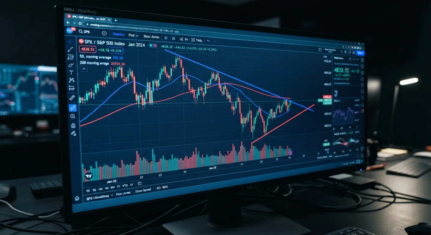
Photo credit: NewBizBuzz.net | Financial Insights For All
In this article
A practical walkthrough of the core elements on any stock chart — from candlestick patterns to volume signals and support-and-resistance zones.
Key Takeaways
- Candlestick bodies reveal the relationship between a session's open and close prices at a glance.
- Volume confirms whether a price move has genuine market conviction behind it.
- Trend lines connect a series of highs or lows to define the prevailing directional bias.
- Support and resistance zones mark price levels where buying or selling pressure has historically concentrated.
- No single chart element should drive a decision — confluence of signals strengthens analysis.
- Chart reading is a complement to fundamental analysis, not a replacement for it.
What a Stock Chart Actually Shows
A stock chart is a visual record of a security's price and trading activity over time. At its core, every chart plots two variables: price (on the vertical axis) and time (on the horizontal axis). The time axis can be compressed or expanded — a one-minute chart suits short-term traders, while weekly or monthly charts serve long-term investors studying multi-year trends.
Charts are part of technical analysis — the discipline of evaluating securities based on price and volume data rather than a company's balance sheet. It sits in deliberate contrast to fundamental analysis, which focuses on earnings, cash flows, and valuation multiples. For a deeper look at the latter, see our practical walkthrough of stock fair value assessment. Both disciplines inform each other within a complete market analysis framework.
Candlestick
A chart element that displays a security's open, high, low, and closing prices for a single time period using a rectangular body and thin wicks extending above and below.
Volume
The total number of shares (or contracts) traded during a given period, used to gauge the strength or weakness behind a price move.
Support
A price level or zone where buying interest has historically been strong enough to stop a stock from falling further, at least temporarily.
Resistance
A price level or zone where selling pressure has historically been strong enough to prevent a stock from advancing further, at least temporarily.
Trend Line
A straight line drawn on a chart connecting successive price highs or lows to visualize the direction and slope of a market trend.
Wick (Shadow)
The thin vertical lines above and below a candlestick body that show the highest and lowest prices reached during the session, beyond the open and close.
Candlesticks: Decoding Price Action
The candlestick is the most widely used charting format because it encodes four critical data points — open, high, low, and close (OHLC) — into a single visual unit. The body represents the range between the open and close. The thin lines extending above and below the body, called wicks (or shadows), mark the session's high and low extremes.
- Bullish candle: Close is above the open; the body is typically green or white.
- Bearish candle: Close is below the open; the body is typically red or black.
- Doji: Open and close are nearly equal, producing a very small body — signals indecision between buyers and sellers.
- Hammer: Small body near the top of the range with a long lower wick — often interpreted as a potential reversal after a downtrend.
- Engulfing pattern: A candle whose body completely engulfs the previous candle's body — a bullish or bearish version can signal momentum shifts.
Candlestick patterns are most meaningful when viewed in context: a hammer at a recognized support zone carries more analytical weight than one appearing mid-trend with no surrounding confluence.
Start with Context Before Patterns
Before identifying any candlestick pattern, zoom out and establish the broader trend. A hammer in a downtrend near a major support level is a very different signal from a hammer that appears mid-trend in open space. Context is what separates meaningful patterns from noise.
Volume: The Confirmation Signal
Volume — the number of shares traded in a given period — is displayed as vertical bars along the bottom of most charts. It is often called the market's conviction meter: price moves accompanied by high volume suggest broad participation, while moves on thin volume may lack follow-through.
Key volume principles worth understanding:
- Breakouts need volume: When price breaks above a resistance level on meaningfully above-average volume, the move is generally considered more credible. A breakout on low volume is treated with skepticism.
- Divergence is a warning: If a stock is making new highs but volume is declining, it may signal weakening momentum — fewer participants are driving the advance.
- Volume spikes on reversals: An unusually large volume spike after a sustained decline can indicate a capitulation event — a point where sellers become exhausted — sometimes preceding a stabilization or reversal.
Volume analysis pairs naturally with macro awareness. Understanding how broader economic data drives market-wide volume surges is covered in our piece on economic indicators every stock investor should know.
Volume Alone Doesn't Confirm Direction
High volume signals participation, not necessarily bullish or bearish intent on its own — a stock can fall sharply on heavy volume just as easily as it can rally. Always interpret volume alongside price direction and the surrounding chart structure. Relying on volume in isolation can lead to misread signals.
Trend Lines, Support, and Resistance
A trend line is drawn by connecting a series of meaningful price points — swing lows in an uptrend, swing highs in a downtrend. The resulting line defines the direction and pace of the prevailing move. An uptrend line that connects progressively higher lows signals that buyers are stepping in at higher prices over time, a fundamentally bullish structure.
Support is a price zone where demand has historically been strong enough to arrest declines. Resistance is a zone where supply has historically capped advances. These levels aren't pinpoint prices — they are bands where price behavior has repeatedly clustered.
A critical concept is role reversal: once a support level is broken decisively, that same level frequently becomes resistance on any subsequent rally, and vice versa. This occurs because traders who previously bought at support — now sitting at a loss — tend to sell when price returns to that level.
Analysts often look for confluence: when a trend line, a horizontal support level, and a significant moving average all align at a similar price, the combined signal carries more weight than any single element. For the common pitfalls that arise when these signals are misread, see our analysis of where investors often go wrong with technical signals.
Putting It All Together
Reading a stock chart effectively means synthesizing candlestick patterns, volume behavior, and structural levels into a coherent picture — not isolating any single element. A practical analytical sequence might look like this:
- Establish the trend direction on a higher timeframe (weekly or daily) before examining shorter-term charts.
- Identify key support and resistance zones where price has reacted multiple times.
- Observe candlestick patterns as price approaches those zones — are reversal signals forming?
- Confirm any pattern with volume — does the trading activity support the signal?
Chart reading belongs in a broader analytical toolkit. It works best alongside fundamental research and macroeconomic context — applied to various asset classes with an understanding of each market's unique characteristics. No chart pattern guarantees a specific outcome, and no level is impenetrable. The discipline lies in managing risk when analysis proves incorrect, not in assuming it will always be right.
This article is for general informational and educational purposes only and does not constitute personalized financial, investment, or tax advice. Stock chart analysis involves risk, including potential loss of capital. Past price behavior does not guarantee future results. Always consult a qualified financial adviser before making investment decisions based on your individual circumstances.
Frequently Asked Questions

Author
Stocks & Markets Editorial Team
Stocks & Markets Editorial Team is the collective byline for our editorial team and contributor network. Articles published under this byline or an editorial pen name are researched, written, and reviewed according to our editorial standards for clarity, consistency, and independence before publication.
View all articles →